Catwalk to Curtains
02 Oct
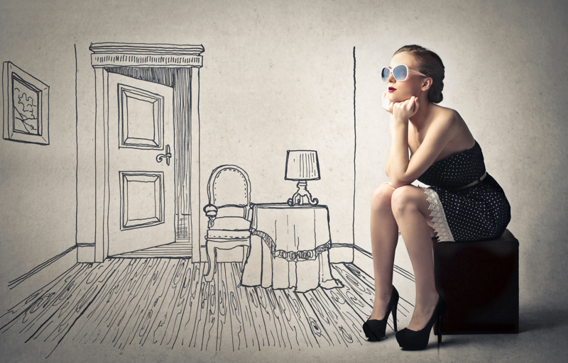
Fashion has always been a fickle thing. One season grey is the new black and the next we're being told that it's blue. With British Fashion Week having only just taken its final steps down the catwalk we have already had a glimpse at what to expect for S/S19 and high street buyers will be eagerly anticipating the deliveries placed in March this year for the second phase of A/W 2018. It's a fast paced, ever changing, got to have your finger on the pulse, kind of environment but is the world of Interior Design any different?
There is, and always has been, undoubtedly a cross-over from fashion to homeware. Pick up any newspaper supplement or magazine and sections on colour or print trends will transcend fashion to homeware. In this article we're looking at the synergy between fashion and design, at in-season trends and predictions, highlighting some of exciting designs, and products that we have found at recent Interior Design shows.
From one Season to Another
Whilst completely refurbishing your home with each season and trend is as impractical and unreasonable as throwing out last autumn's jumpers adding, an element of the new can revitalise your home as much as a pair of new boots can refresh your look. Recognising the colours of the moment and accenting with soft furnishings, the fashion accessories of Interior Design, will have immediate impact.
One way of seasonally keeping things fresh and to avoid huge expense is to work with a neutral base palette and choose different accessories for Spring/Summer and Autumn/Winter with a special set for Christmas.
Even though the Pantone Colour Institute proudly announced at the beginning of the year that 18-3838 Ultra Violet would be the colour for 2018 there has been a significant lack of this in both fashion and interiors. We have seen complimentary pastels and even contrasting greens however not a shift towards the purple. I love purple so would welcome seeing more of if in all its shades however, colour predictions can be wrong. For most people simply reacting to the current mode is enough and in this age where we are immersed with images from social media and the internet we sometimes do not even register that our choices are being subliminally swayed one way or another.
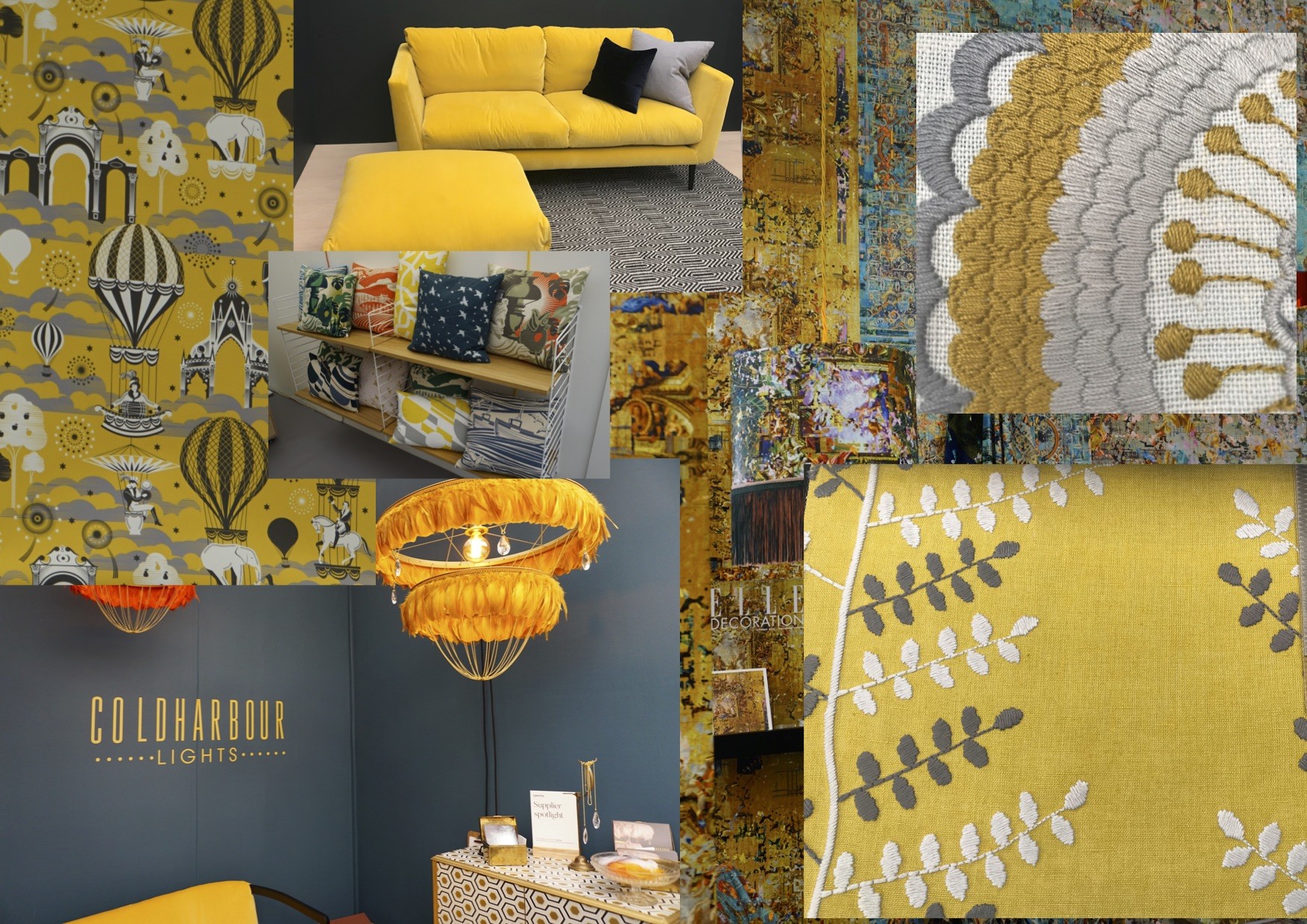
We have seen grey take the mantle as the new neutral in both fashion and design over the past couple of years with varying shades and tones working well with soft pinks, whites (never cream!), pale blues and a range of metallics from brushed yellow to rose gold and copper. Add mustard yellow to this and you're looking at this years hottest on-trend colour. Although it's been around for a while now in interiors and was one of the sought after fashion colours for S/S18 the lines between our wardrobe and, well, the wardrobe itself have truly merged.
We spotted this fabulous mustard velvet chair by Dassie Artisanwhilst at Top Drawer in Olympia earlier this month. This chair has an immediate intense impact especially displayed on the dark grey flooring.
It is perfect for adding a luxurious feel to any room and could be styled with a deep petrol blue for a truly opulent finish or with dark leather, soft faux-fir and lighter greys or pale wood for a relaxed Scandi-style.
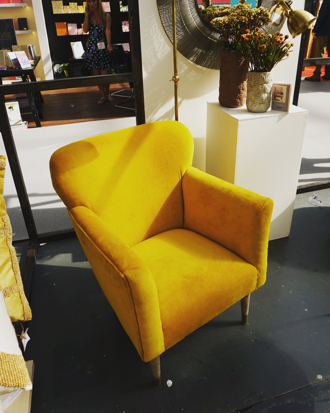
In the warmest shade of yellow it has happy connotations which evoke the feelings of comfort, happiness and optimism. Yellow is the brightest of the spectrum and it is known to be the colour which is the most noticeable to the human eye.
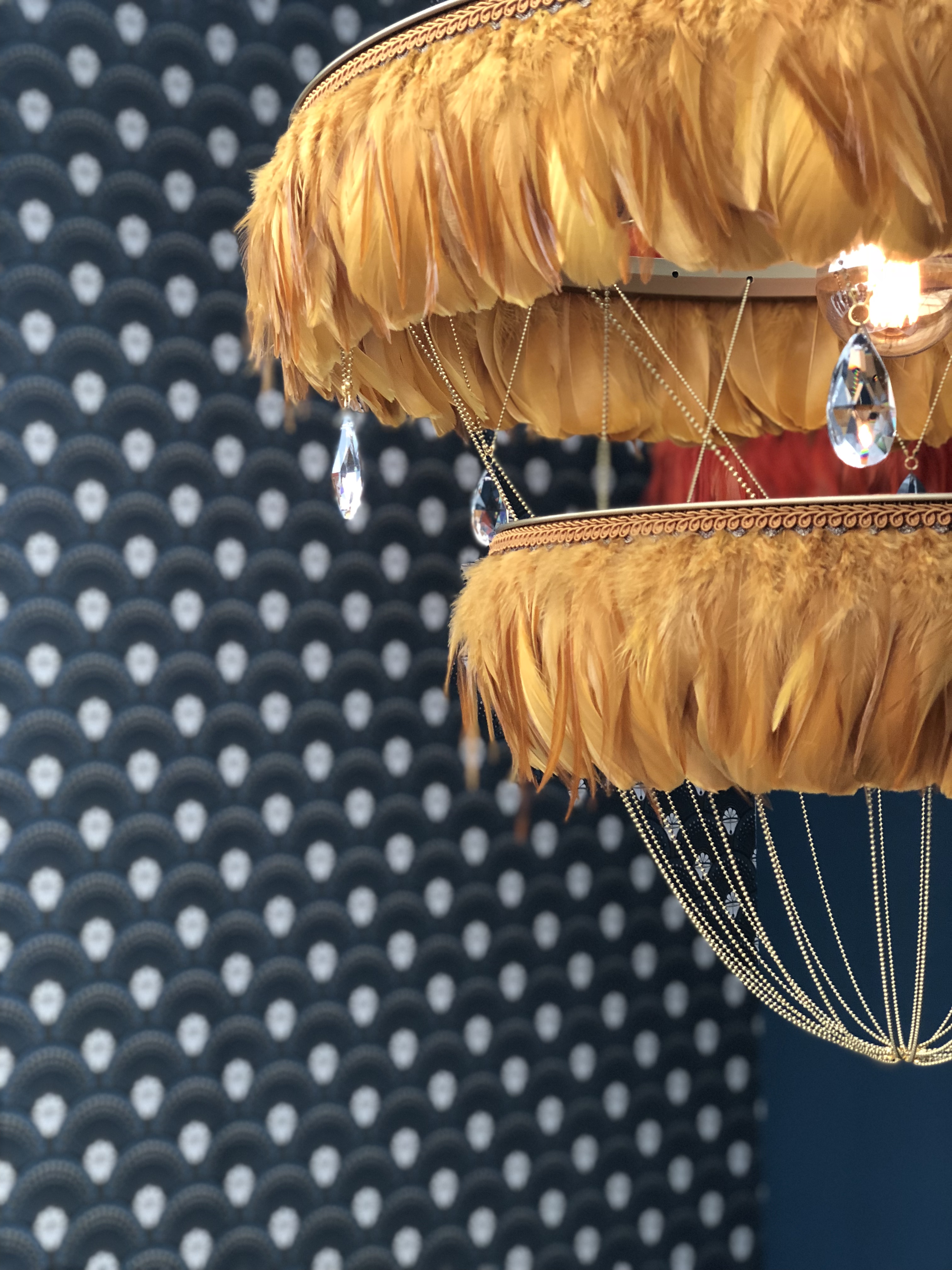
Whilst this colour maybe a bit bold for some it was everywhere to be seen at Decorex Intl from rugs to throws, cushions to lamps and in patterns, solids and just the tiniest of hints. We simply adored the feather lampshades by Coldharbour Lights, London (image courtesy of Divine Savages):
It works perfectly with navy as well as grey so why not add it in moderation with a vase, or a pot and then gradually add more as your confidence grows - we guarantee you'll be as hooked on the colour as we are before too long!
"Some painters transform the sun into a yellow spot, others transform a yellow spot into the sun" Pablo Picasso
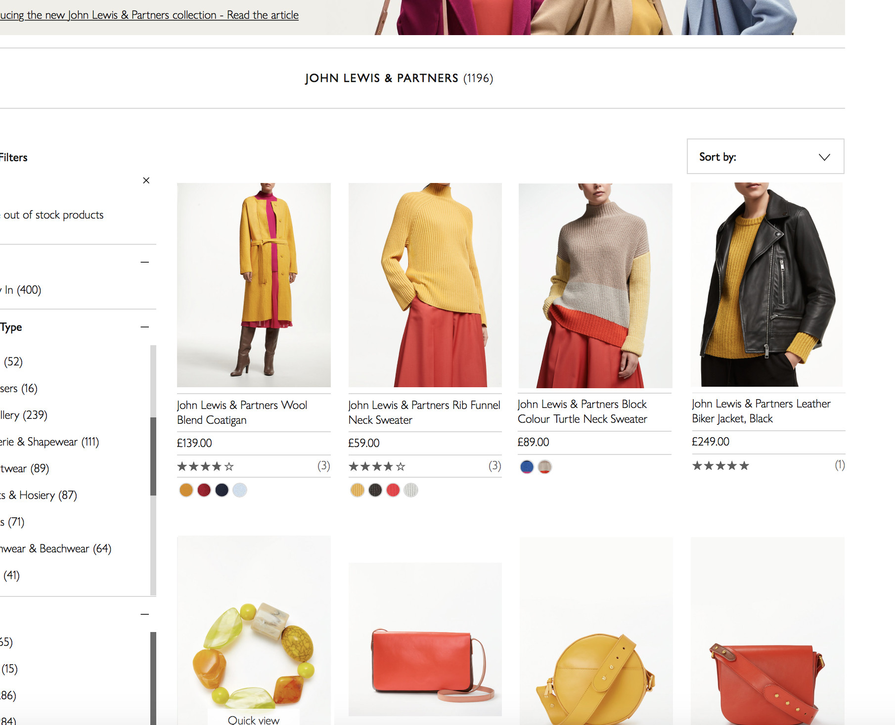
A fabulous colour for your autumn wardrobe too, high street fashion houses such as John Lewis & Partners have revived this colour for their A/W18 collections. A simple browse on their new season women wear collection returns an instant mustard yellow hit!
Something More Subtle
This year we have seen another colour transcend from the catwalk to our homes. More specifically, a colour palette - pastels which were a firm favourite for Spring 2018 and also cropped up again in some collections at London Fashion Week recently for S/S19.
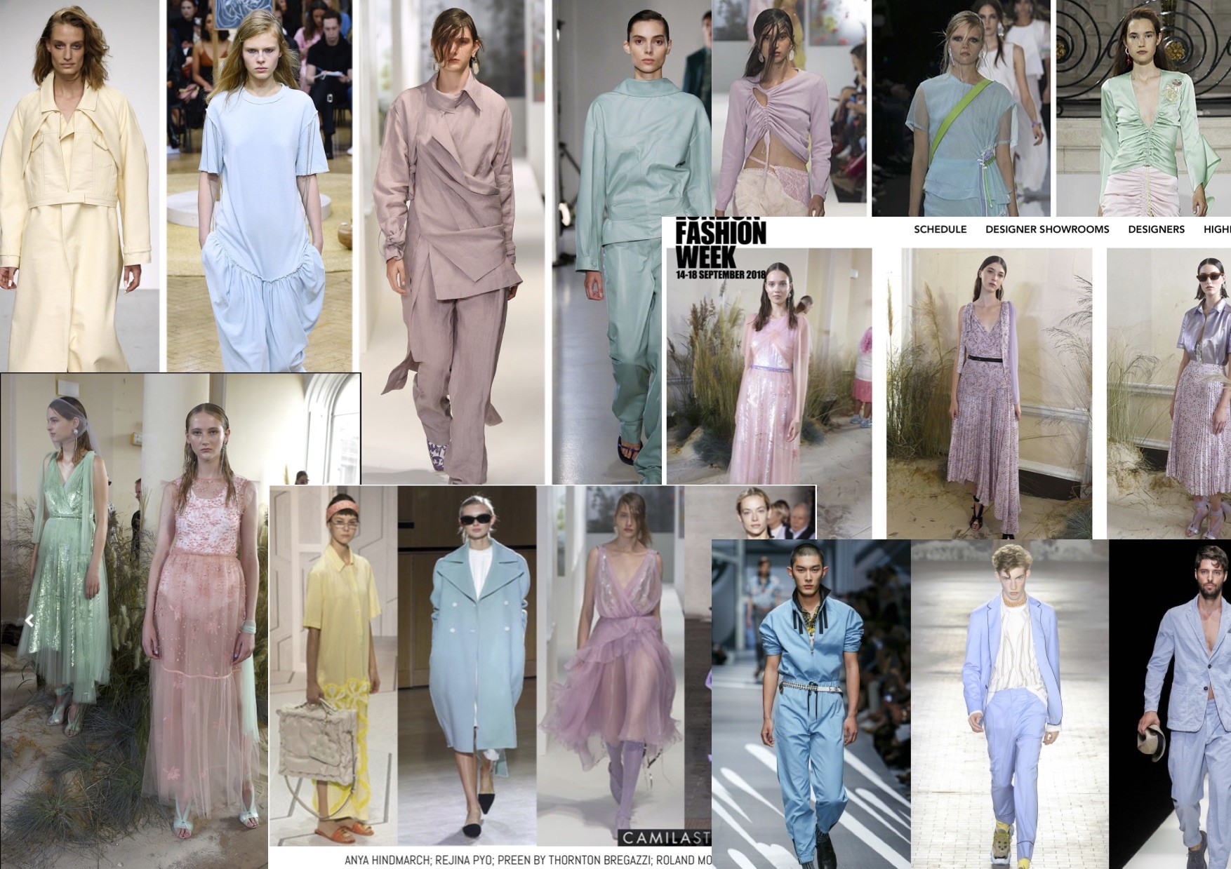
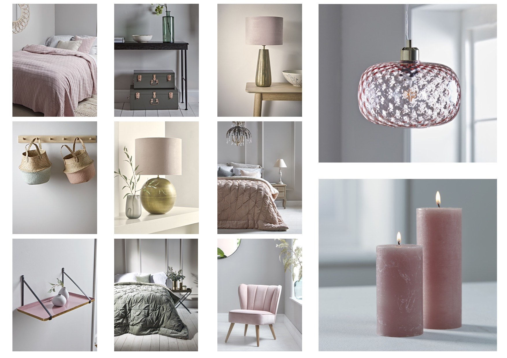
Perfectly complementing the new neutral of grey, pastel pink, soft lemon yellow, mint green and powder blue have made a real impact in interiors and can be mixed and used within the same space as excellently shown in the image below, courtesy of Walcot House. What is more they work wonderfully with light blues, yellow gold, brass and rose gold. Used well and this palette is soft, calming and very sophisticated and what's more, it looks stunning throughout the year.
At Decorex Intl, we were mesmerised by the impact of these contemporary hand blown glass bottles by Jonathan Rogers. Back lit and sitting in an alcove these simple groups of frosted and translucent pastel coloured bottles had immediate impact.
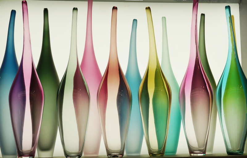
This colour palette works well with different styles of interiors and is equally effective as an accent to a stark industrial look as to a French country elegance.
Many of the online interior stores have these colours in their collections such as Cox and Cox (please see images below) and Loaf and by the power of social media this short video from Dusk keeps coming to our attention, showing a bed being made in just these colours! It indeed shows the power of a great accessory.
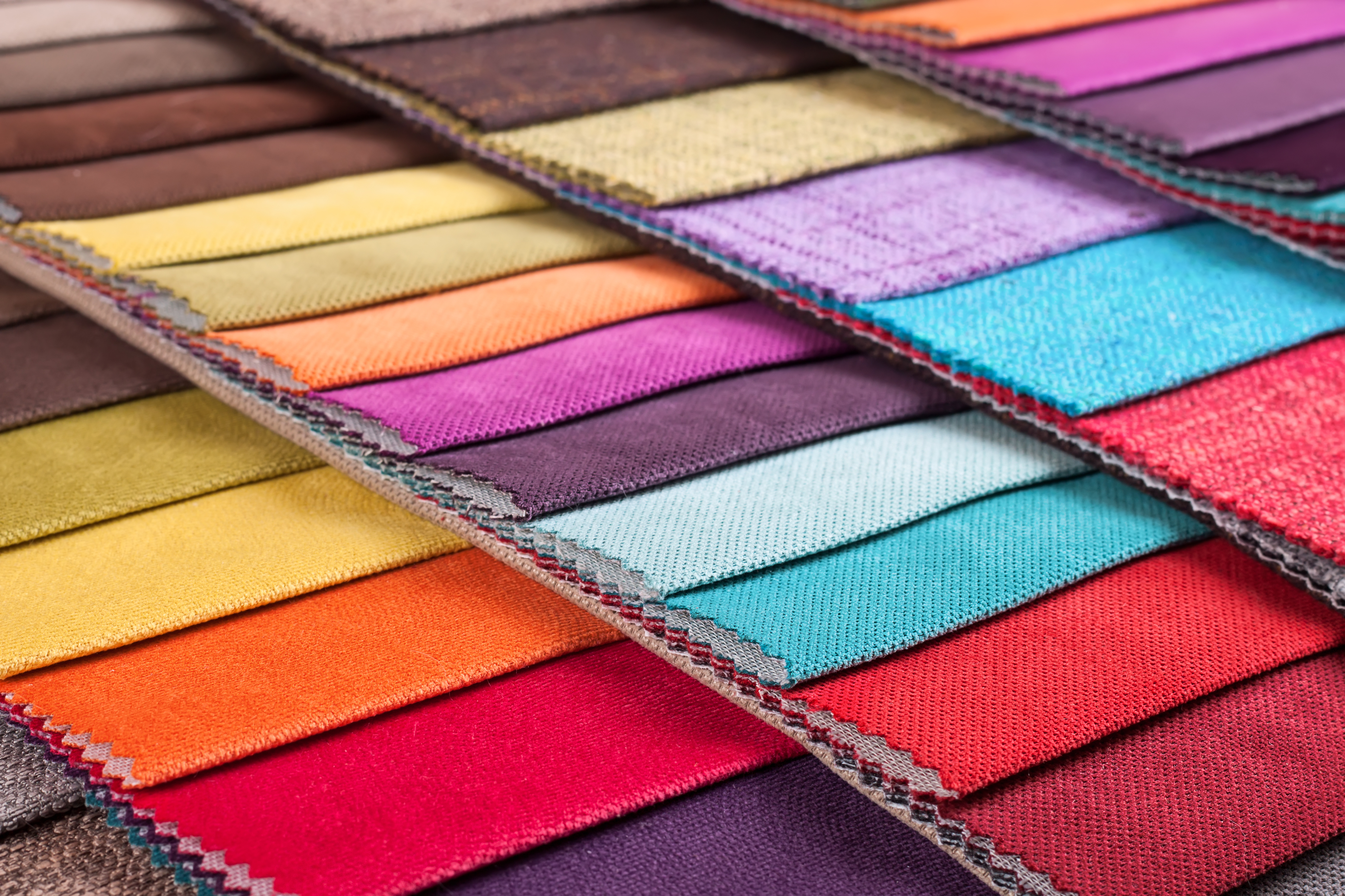
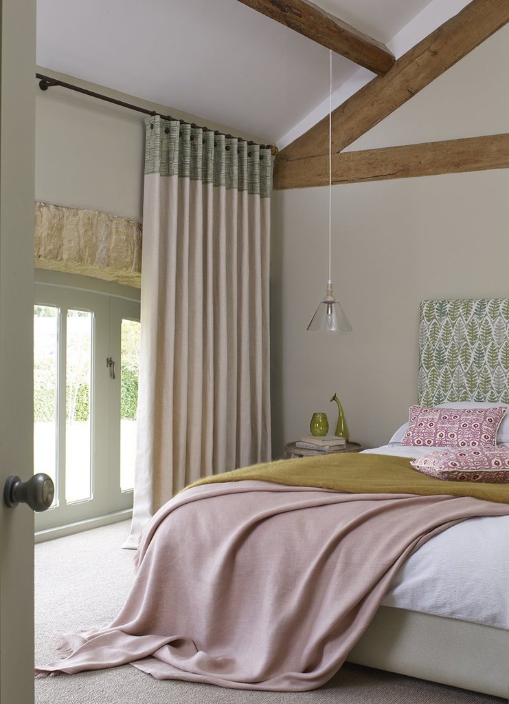
What we love more than anything is when these two colour trends meet! Match your colour palette to offer consistency in the design but add different tones to add depth. Mix your textures to avoid the design from feeling flat and uninteresting. Velvet always feels luxurious and there are some fabulous sculpted velvets that add another dimension all together. Mix these with embroidered fabrics with natural linen and wool combinations and you will instantly bring a touch of luxe to your home.
However, when you decorate your home always use colours and shades that work for you. Don't choose something just because it's the colour of the moment. Choose something that 'makes your heart sing' (a recent quote from a client whose bedroom we remodelled). This way your room/home will connect with you for far longer than if you go for the latest trend without having that emotional connection. After all where else can you show your true colours if not in your own home?